Top Ten Fourteen Cover Trends I Love and Loathe
I thought this was going to be a tricky topic for me, and it was, I’ve edited this so many times!! OK, so I know there are a ton of things I like and dislike on covers but I haven’t consciously sat down and thought about it much before, I decided to actually think about it today so I could organise my thoughts and create a post that makes sense… I’m not sure I’ve achieved that! I wanted to do a rant-style post on this a while ago and saved it all up for today… and I’ve basically discovered that in most cases there can be exceptions to my own cover rules. Brace yourself.
Cover Trends I Love:
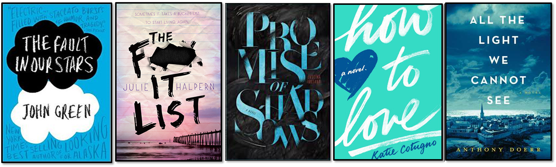
1. All About The Text – I’m a sucker for a book with a delicious font, or a large font that is the main focus of the cover. I love reading, so it should come as no surprise that I love words, and quotes, and that these things are even better when they are made to look awesome. Bonus points if the text is embossed or indented.
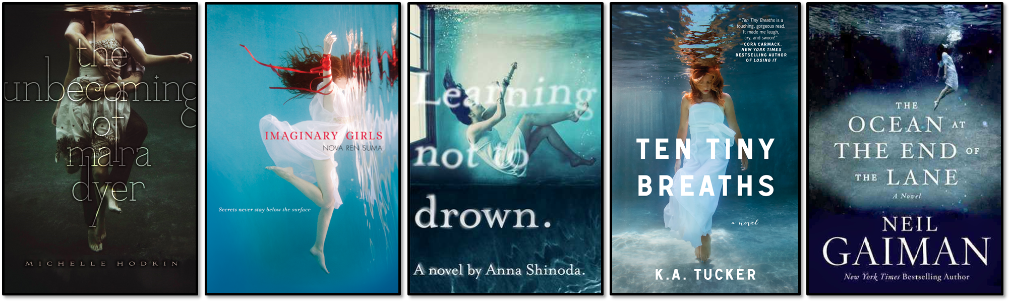
2. Drowning/Underwater – It’s not as sinister as it sounds! I discovered in a previous Top Ten Tuesday (Covers I Would Frame as Works of Art) that I’m fond of having actual people on my covers; photography as opposed to illustrations. More than that, I’m particularly fond of people who look as though they are drowning or are underwater. Strangely, I have yet to find a mermaid cover I like (I haven’t actually read a mermaid book at all yet either).
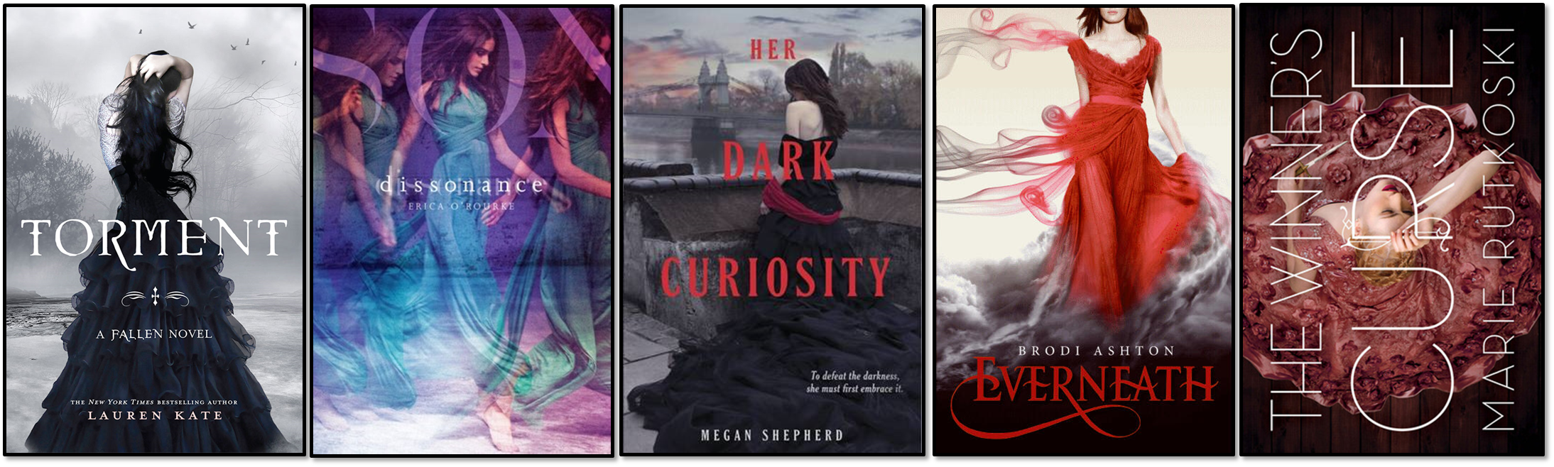
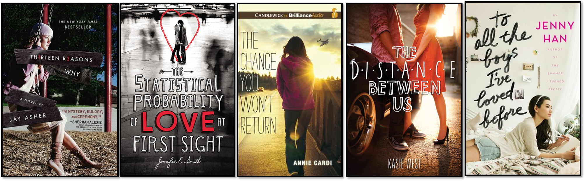
3. (Moody) Girls in Dresses – What is that I hear you cry?? Shock, horror! Yes. I seem to like the trend that everyone else hates. But only when it’s done well. Or at least, “well” in my opinion. There are plenty of “girls in dresses” covers that I don’t really dig at all (I’m looking at you The Selection).
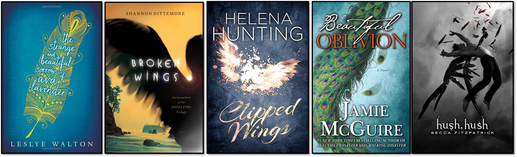
4. Wings and Feathers – I’m not entirely sure why I like wings and feathers on covers, but I do. As soon as I see a hint of a wing or the tip of a feather I’m drawn in to find out more. The images below also feature some other elements of covers I enjoy, like silhouettes and people who look like they’re falling (or just throwing some bad-ass shapes).
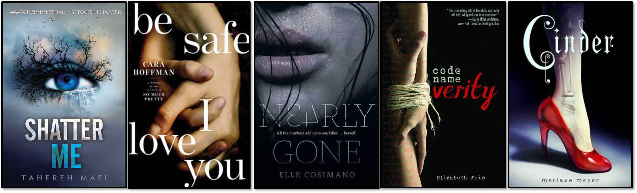
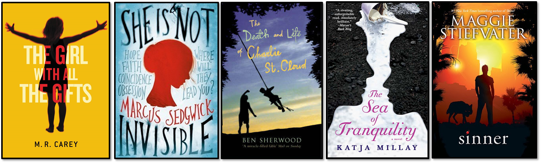
5. Random Body Parts – I know, I’m beginning to sound like I’m making Frankenstein. I only like this when it’s done in a particularly arty/moody way, I think it can be mysterious and emotive. I don’t usually pay attention to covers with full faces; they always seem cheesy or never actually match the character description, which is just annoying.
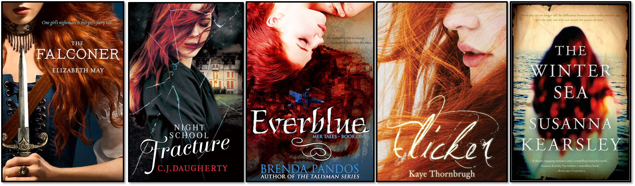
6. Girls with Red Hair – Arghhh! I wish I knew why I like this trend but I can’t really pinpoint it! Maybe because red hair is associated with a fiery female character?? And I like those?? If a book has a red-haired girl on the cover I’m usually sold (unless it’s a red-haired girl on an overly illustrated or a boring high fantasy cover).
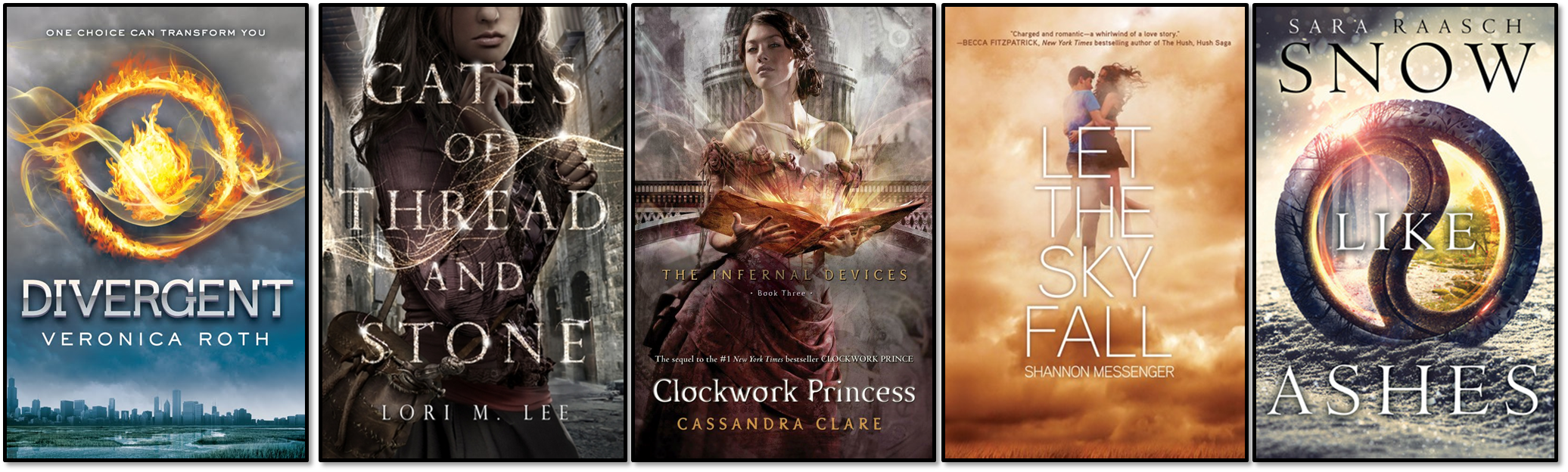
7. Steampunk-esque and Glitzy – I don’t know what else to call this random collection of covers that I really like and I can’t quite pin down what it is about them that makes them feel similar, some have a steampunk vibe, some have swooshes and symbols. If you can think of what the similarities are please let me know!
8. Silhouettes – I can usually take ’em or leave ’em, but some of them are very well done – particularly The Sea of Tranquility below, I love it when covers are smart – when elements of the image make up something else and you have to look twice to see it.
Cover Trends I Can Take or Leave:
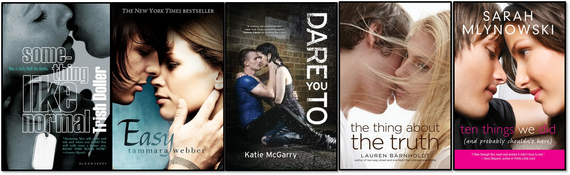
9. The Almost Kiss – I wouldn’t go as far as to say I loathe these, but they definitely don’t fall into my love category. I’m not a big fan of the almost kissing covers – they wouldn’t necessarily put me off a book, but I’d probably try to get my hands on a different variation of the cover, or read it as an eBook…
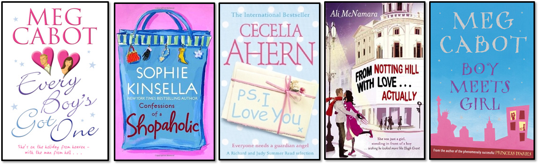
10. Standard “Chick-Lit” Illustrations – I spent so many of my teenage years reading all the “chick-lit” I could get my hands on until I reached the point where I literally couldn’t take any more and the plot-lines all blurred into one. I pick up a good piece of chick-lit from time-to-time but haven’t immersed myself in it for quite a while.
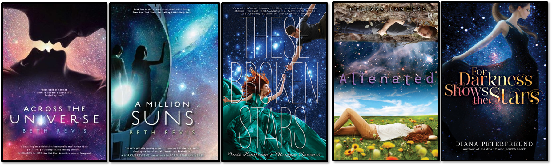
11. Stars and Galaxies – I’m not sure how I feel about these. Some of them can be pretty to look at but I’ve never seen one up-close-and-personal to know if I like it or not. They are kind of mesmerising though…
12. General Contemporary – As it’s Summer, contemporaries are springing up everywhere. There are some contemporary covers I enjoy more than others, and in general they are pretty non-offensive, but they rarely wow me.
Cover Trends I Loathe:
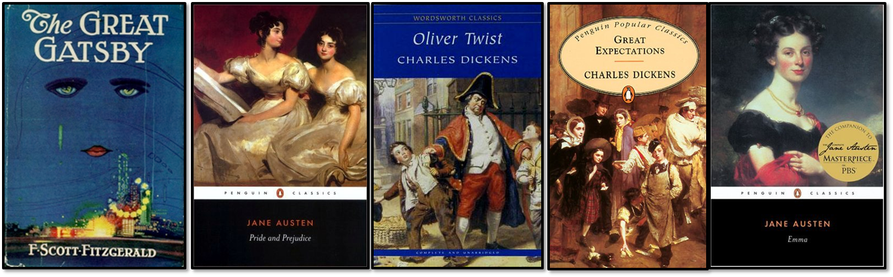
13. Boring Classics – I’m taking part in the Classics Club and download many of the classic titles I want to read for free on-line. Sometimes I want to own one of the classics though, and that’s when things can get a little tricky. It can be very difficult to find a modern cover adaptation for a classic that isn’t dull, dreary and downright dismal.
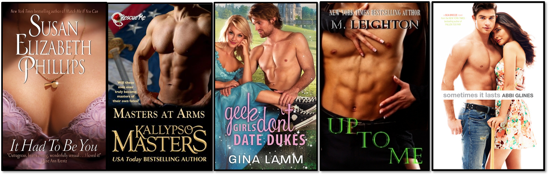
14. Nudity – I enjoy some eye-candy as much as the next girl, but nudity on covers, mostly on Romances obviously, just really annoys me. Especially costume nudity for some reason, like pirates, or period drama romances. I just don’t see the point in these covers and think it makes the whole genre look seedy.
I think I’ve come to the conclusion that I’m not a very fussy Book Geek when it comes down to covers. I know what I like and what I don’t, sometimes it works and sometimes it doesn’t. The absolute, total worst for me though are those covers that look like a 5 year old threw them together in Microsoft Word, what is that about?!
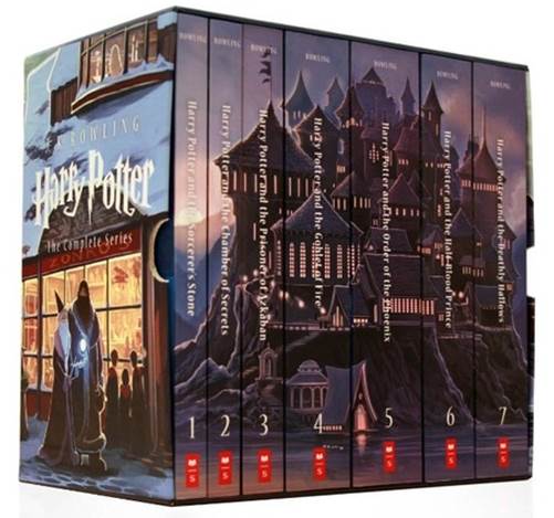 I have to give an honorable mention to the Special Edition Harry Potter Collection that makes up Hogwarts Castle when the book spines are lined up in a row. I am dying to get my hands on this if anyone knows of a reasonably priced retailer in the UK? Let me know in the comments!
What do you love and loathe on your book covers? Do you agree with my choices? Or disagree with me completely??

Fantastic post!! I loved reading all of these – you have some really lovely and interesting covers on the list. I especially love Shatter Me and Torment. I also love books with the fancy text covers. I can’t agree with you more about the classics…their boring and hideous covers never make me want to read them. Same about chick lit – they need to come up with some more eye-pleasing stuff. And as far as nudity on covers, I’m not a fan, either. Some of them are done well enough I don’t mind. I particularly dislike Abbi Glines covers (but love her books). I love those types of books but I’m always glad I read them on eBook so I’m not flashing their horrid covers. 🙂
LikeLike
Thanks, Brandie! 😀
I should include a disclaimer that I haven’t read all of the books featured, though many of them are on my TBR. It’s really difficult to find a decent classic cover at a reasonable price. Even when they reprint them with the “wall paper patterns” as I call them, they still don’t do it for me. Time for a re-invention I think! I like the Penguin Drop Caps series – but they’re only select classics, and even then I’d prefer a contemporary do-over (http://www.barnesandnoble.com/s/?series_id=821430). I think the romance covers take away from the story, I don’t read that type of romance often, but I’d be more inclined to try them if they didn’t have that style of cover.
“They” do say eReaders are part of the reason 50 Shades did so well, and why both erotica and romance genres are experiencing a come-back, because no one can see what you’re reading! I remember reading a poll where a ridiculously high number of people said if they ever lost their eReader and it was found they wouldn’t claim it because they’d be embarrassed by the content! R x
LikeLike
LOL. I think most of my friends know I love smutty novels and wouldn’t be surprised at what they’d find on my Kindle. It’s a shame that those covers deter people from reading because some of them are wonderful books with a lot more to them than sex (Hard Time by Cara McKenna is an example of a recent one – the cover is a shirtless man and it screams SMUT, but it was a really incredible and emotional read for me).
I haven’t read all of the books on my post, either. A lot of them are ones I’m anxious to read soon! 🙂
LikeLike
The almost kiss makes me think of this pin:
😆
LikeLike
Hahahaha. Very true! I don’t even know what a non-movie tie-in of a N Sparks book looks like! R x
LikeLike
They’re really boring photos, like the kind used for inspirational posters and computer screen backgrounds. The almost kissing is actually preferable. 😉
LikeLike
I’d rather have something/one pretty to look at any day than a generic stock photo. Very occasionally I do prefer tie-in editions of books… R x
LikeLike
you just can’t beat a cover which is primarily a pretty font with lovely text on it! *.*
LikeLike
I completely agree!! 😀
LikeLike
they can be so simply but they catch your eye so effectively!
LikeLike
Love it, especially the book covers featuring underwater photography. I’m sorry to say I don’t read a lot of contemporary novels and it does have something to do with the almost-kiss/perky illustrations that give off that oh-look-a-boy-I-must-fall-in-love-with-him vibe. That HP collection is so pretty…
My TTT
LikeLike
Thanks 😀 I lurve the underwater photos, and I’m the same. I do read contemporary, but rarely the teeny-boppy covered contemporary. I haven’t read LOADS of the popular ones because the covers make me think of 16 year old puppy love. Though apparently I’m missing out with Stephanie Perkins so I’ve added those to my TBR. I NEED that HP collection in my life. My dad offered to get me it as a late Birthday present, but I’m trying to find a UK retailer that stock it at a reasonable price. It seems to be much, much cheaper in the US. R x
LikeLike
Haha. I also like moody girls in dresses on book covers! And red-haired cover models are always a yes to me.
And Silhouettes are on my TTT, too. I just love books with silhouettes!
I usually like the almost kiss, and I don’t mind standard chick lit – although I don’t hate them either, like you.
LikeLike
Haha I’m glad I’m not the only one, as most people don’t seem to like the dress trend, and I really don’t know why the red heads draw me in!!
The Almost Kiss can be done in a way that it’s not as bad, I quite like Something Like Normal, but I think the typography helps it. You can spot Chick-Lit from a mile away with those covers, which may be the point, to make it easy to identify?? They don’t annoy me, but they don’t make me stop and pay attention either. Though at one point I was coming down with them! R x
LikeLike
Wonderful post!
LikeLike
Thank you! 😀
LikeLike
I have to say the majority of covers you showcase here are… ones i would avoid. They all have too much going on. I’m ALL for simplicity.
Also, the only ones i would say i do like are the classics, ha! But that’s less for aesthetics, and more because i like reading classics. When i go to a bookshop, i will head straight for the classic lit section, which is full of covers like those, and it’s more for the sense of love i get for the books, being associated with the covers, rather than the covers themselves. Does that make any sense?
I finally jumped on the Top Ten Tuesday bandwagon this week, and it feels pretty good 🙂
LikeLike
Most of them?? Really?? I must check out your TTT to see just how simple you go! I did have two more sections I was going to include and forgot, which was black covers (or mostly black covers) with a pop of colour or feature, like Gone Girl and Noughts and Crosses. I was also going to feature Historical Fiction. I never would have picked up a historical fiction book based on the cover, but read and loved The Cousins War series after watching the TV show and ended up buying the TV Show tie-in covers because they were nicer.
It does make sense. I unfortunately haven’t read as many classics as I’d like but I’m trying to work on it. I do think more appealing covers might help me…
I love doing TTT posts. Usually, there’s a rant or discussion topic I have in mind and at some point a TTT or meme covers it so I hold off until then. One future post this TTT has inspired is the very little input authors have into their covers – going to write a piece on it, I was surprised they don’t have more say. R x
LikeLike
Most of them, yeah. I don’t mind the typography ones. The underwater ones don’t bother me one way or the other. And the ones you’ve chosen for silhouettes are quite nice. Otherwise… not at all my style. I would avoid, avoid, avoid on a bookshop shelf.
There is a mostly black cover featured in my TTT, and it is definitely one of my favourite covers ever. So simple and striking. (Which sums up exactly why i like simplistic covers!)
I would recommend trying some of the republished classics by Penguin. They do some gorgeous cover sets for classics.
If i was an author i think my biggest fear would be getting stuck with shitty cover art. Definitely a rantable topic!
LikeLike
Rachel, I am with you on the special fonts/text on the front of a cover; have you ever seen the cover for a book called The Art of Fielding? One of my all-time favorites! Yours are great! Also, love that you added the Harry Potter box series; I hadn’t seen that…makes me want to get a set, even though I already have all of the books – ha! Great post! Thank you for visiting mine today, as well.
LikeLike
This the one?? http://www.goodreads.com/book/show/10996342-the-art-of-fielding I love text. I’m pretty sure if I could I’d cover my walls in quotes in amazing typography! I own the set too but mine are the original Bloomsbury covers, mostly hardback, and they can be chunky to read and I don’t want to ruin them rereading, so I’d like a nice paperback set and that is by far the nicest I’ve seen. There are a TON of HP cover changes I’m not a fan of! Thanks for commenting 🙂 R x
LikeLike
Love silhouettes and the covers with special font treatments. I also loathe the almost kiss and scantily-clad cover models. Great picks for this topic!
LikeLike
Thanks for commenting! 🙂 I don’t know anyone who thinks the half naked covers are a good idea, even those who read and love romance and erotica!
LikeLike
Oh I like the wings/feathers trend. But I’m also drawn to that motif in decor and clothing too. It’s interesting that some of these trends might transcend book covers and find their way into clothing or furniture. I think the stars and galaxies are likewise showing up in different arenas.Great list!
LikeLike
Thank you, and thanks for commenting 😀 I’m partial to a feather or two in design in general as well. Not sure where my love for water comes from though! R x
LikeLike
I’m with you on that too though. There’s something captivating about that underwater look.
LikeLike
I agree with all of your likes and most of your dislikes. Especially the almost kiss and nudity. I still like stars/galaxies and I guess classics can be whatever because we pick them up for their history as a good book, not because a cover catches our eye. I can’t really pinpoint what I like or not. I just do or don’t but contemp and chick lit are usually blah!
LikeLike
I think I might like some of the stars and galaxies, not so fussed on the second one though where it looks like they’re in a spaceship… I don’t own any (yet) so I’d need to see one in the flesh. True, and like I say so many of them can be downloaded as eBooks now for free that it isn’t a big problem, but it would be GREAT to have modern covers so we can have beautiful versions on our shelves 🙂 R x
LikeLike
Great post! I agree with your last two dislikes. No one wants to see the goods on the front cover. In fact, I would never buy a book like this because it’s almost too embarrassing. Also, I really liked your number 2 pick (drowning in water). I never thought about it as a book trend, but now I notice a lot. It adds a sort of mystery and whimsy to the cover, and it makes me want to find out what is going on in this book. Also, NEIL GAIMAN! That is all 😀
LikeLike
Thanks, Rachael. I’m embarrassed to say I’ve yet to read Neil Gaiman, I’ve nearly bought a couple of his books on a few occasions, but I’m afraid he’s going to be one of those authors other people love that I don’t get. I wanted the Ocean at the End of the Lane but when I read the blurb it seemed quite fantasy-ish, and me and fantasy have a bit of a love-hate relationship! R x
LikeLike
Yeah, if you don’t like fantasy then Neil Gaiman may not be for you. Although, he does his fantasy a little differently than traditional fantasy authors. He likes to take a real life story and inject fantasy and magic into it. The closes book to true fantasy he’s written was Stardust.
LikeLike
See I liked the movie!! I can be funny with fantasy/high fantasy. I still haven’t read GOT yet even though I own them all. What would you recommend to someone who likes Neil Gaiman to see if I like or have read any of those? R x
LikeLike
Definitely try Stardust if you liked the movie. It was a lot like the book. You might also want to try reading Coraline and The Graveyard Book. Those are young adult/children’s books, but they’re easier to get into and might give you an idea of his writing style. I think where a lot of people go wrong with Neil Gaiman is they try to jump right in by reading American Gods or the Sandman graphic novels, and those are definitely some of his more adult works. He also wrote a graduation speech that has been turned into a book that’s supposed to be really good (although, I haven’t gotten around to reading it yet). It’s called Fortunately, The Milk, or if you’re into something more artsy, there’s his Make Good Art speech. He’s a pretty versatile fantasy author.
LikeLike
Thanks!! 😀
LikeLike
I LOVE that edition of Harry Potter! My husband got it for me for my birthday! They are BEAUTIFUL! And the drowning covers…I would never have thought of those as a thng, but I LOVE them! 😉 Great list!
Jennifer @ A Librarian’s Library–My TTT!
LikeLike
Lucky you! I’m so, so tempted by them… and yes, I’m definitely addicted to underwater covers! Thanks for commenting 🙂
LikeLike
Your list is just so wonderful! There are so many trends here that I love. ❤
LikeLike
Thank you! And thanks for commenting 🙂
LikeLike
This is a great list! I totally agree about the boring classics- I think this is why I shy away from them in general, (and why in high school everyone thinks they’re awful) because the cover looks super dated. I do, however, love me some stars and galaxies 😉 And I am totally with you on the font thing, it makes or breaks a cover!
LikeLike
Thanks! 🙂 I definitely think I’d be more inclined to pick up a classic if it had a rejuvenated cover! R x
LikeLike
I’m loving a LOT of these covers. But I actually love star covers (they made my list!)
Nicole @ Feed Your Fiction Addiction
LikeLike
Thanks, Nicole! I’m beginning to think I’m being swayed with the stars and galaxies covers! R x
LikeLike
That Harry Potter collection is just too awesome for words there!! I would so totally buy that… *Swoons a little*
AHEM. So absolutely yes on the half-naked covers. Ugh. They’re just embarrassing, frankly. And I also hate chick-lit covers because they make me feel the book is going to be fluff even before I start it. (Though, well, I guess chick-lit IS usually fluff…right? >_<) I'm actually a bit sucker for galaxy and also the dresses. The dresses are BEAUTIFUL! How can I not love them?!
LikeLike
I LOVE it! The cheapest I’ve found it in the UK is £50… HP never seems to go down in price! I can get a different set for 47.99 with 20% discount and another 18% cashback on top which would make it £31.49, but it’s definitely not as nice (http://www.theworks.co.uk/p/adventure-stories/harry-potter-paperback-boxed-set/9781408812525). Chick-lit is usually “fluff” reading, but sometimes I like that too, I guess having a style for a genre is kind of the point though, if you think of branding, the publishers probably want to make it obvious which genre each book belongs to and do that through the covers. Though it would be nice to see something a little different! Yay, another dresses on covers fan! 😀
LikeLike
Fantastic post! I like that most of the trends I dislike are ones that you like. Underwater made my dislike list but there are a few covers that I really like. I think it’s becoming more popular now and that’s what’s putting me off. Love the Ten Tiny Breaths cover though. The naked/half-naked covers bug the crap out of me, not a fan at all.
LikeLike
Thanks, Charnell! I lol’d a little when I saw your post thinking it was obvious that we’d like different covers, you’re the ying to my yang… or something along those lines… I think I discovered through this week’s TTT that even if it’s a cover trend I think I like, it can still be done “wrong” for me. So it’s probably more a case of hit or miss in general for individual tastes. Those neked covers are just wrong! They aren’t even arty or tasteful, just greasy and corny. R x
LikeLike
[…] Top Ten Tuesday – Books for the Beach Bag – Best Books of 2014 So Far – My Summer TBR – Cover Trends I Love and Loathe […]
LikeLike
[…] gonna cheat a little and link to my Top Ten Covers I’d Frame As A Piece of Art and my Top Ten Cover Trends I Love and Loathe. These took quite a bit of time to put together and a lot of my favourite covers are included in […]
LikeLike
[…] Is this a real thing? Should I search this and find out? Or is this related to girls in dresses on book covers? Drown the Gown – now there’s a post title I could work with. Except I don’t mind dresses on covers, as I’ve previously mentioned here. […]
LikeLike
[…] don’t particularly like the fact that I do this, but come on, we all do it! I did an in-depth Top Ten Tuesday post on cover trends I love and loathe this year, that really showcases the kind of covers I’m attracted to and the ones that are […]
LikeLike
[…] Cover Trends I Love and Loathe (June […]
LikeLike